New Engine, New Logo!
Hot off the press!
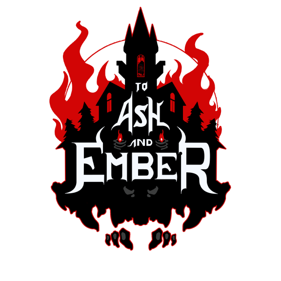
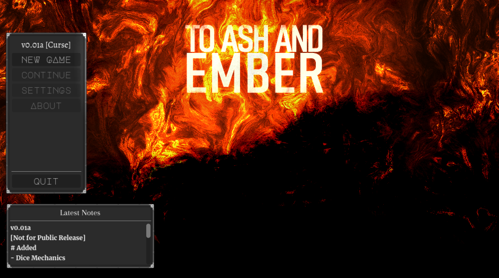
I figured since I was already rebuilding the project, I may as well rebuild the logo. The old logo had a number of fundamental problems to it:
1) It wasn't clear from the typography/logo what sort of genre the game was set in beyond 'vaguely medieval/fantasy'
2) The logo didn't really communicate the idea/feel of 'horror game'.
3) The design of the logo didn't incorporate anything from the game into it.
4) The logo's coloration would make it difficult to print on any sort of shirt, etc due to it having so many colors.
5) From a distance, the logo was not very readable.
This new logo should address the majority of those issues! It's not a perfect one either, of course, as I only spent a day putting it together, but I think it's a big jump up from the previous logo in all those respects. Anywho, just another mini-update. Enjoy!
I now have two logos: an in-game print version and an out-of-game marketing one. I'll probably pull these two closer together over time too. Or, hopefully, and with your support, hire somebody to make something between the two that pops!


Get To Ash and Ember
To Ash and Ember
Survive in an Ever-twisting City
| Status | In development |
| Author | Firgof |
| Genre | Strategy, Adventure |
| Tags | 2D, Atmospheric, Deck Building, Dungeon Crawler, Fantasy, Furry, Horror, Retro, Roguelite |
| Languages | English |
More posts
- Even Minier-Update #13: Foundations (Followup)Jan 13, 2025
- Mini-update #13 : FoundationsJan 07, 2025
- Polling for PatreonDec 31, 2024
- Notification of early showstopper/gamekillerDec 30, 2024
- Donationware copies sold out! (Also boss music)Dec 29, 2024
- Three donationware copies left!Dec 28, 2024
- Changelog [v0.41 Bluedawn] (incl v0.4 Silverdawn)Dec 25, 2024
- [Special Release] Happy holidays!Dec 25, 2024
- New Subscribestar Release: SilverdawnDec 24, 2024

Comments
Log in with itch.io to leave a comment.
Looks awesome!